Unit 1 Lesson 8 - Graphical Representations of Summary Statistics
Graphical Representations of Summary Statistics
Unit 1, Topic 1.8: Graphical Representations of Summary Statistics
Overview
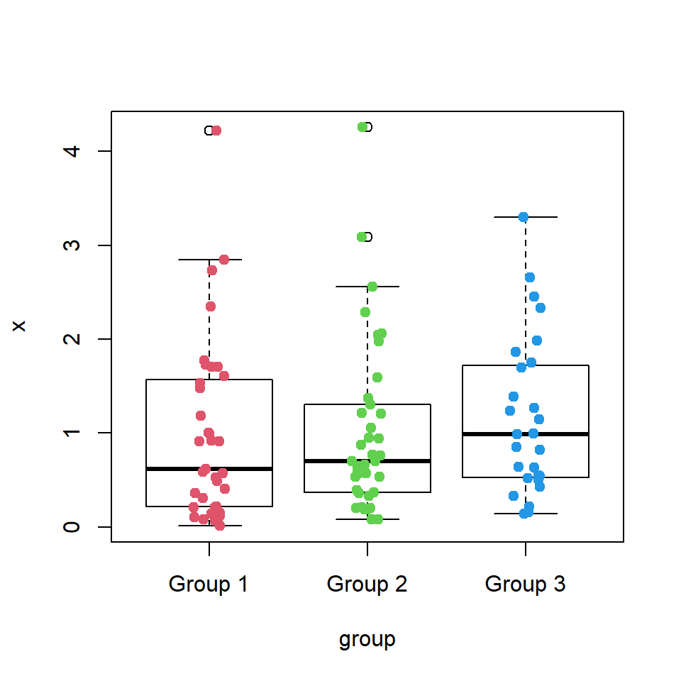
This lesson focuses on creating and reading boxplots to summarize quantitative data (like test scores or commute times) with key numbers. Boxplots show the middle, spread, and odd points clearly. Context, like who the data is from, matters because it explains what the numbers mean. For example, a boxplot of "5 minutes" could be commute times for nearby or far students without context.
Quantitative data uses numbers to measure amounts (e.g., height, time). We’ll build boxplots using the five-number summary (lowest, Q1, median, Q3, highest) and spot outliers. This helps us describe the data and connect it to real situations.
Assignment:
Part 1: Guided Practice Activity
Work on your own. Use the data below from 15 students (from a class survey). Construct a boxplot and describe it.
Data:
- Test Scores: 55, 60, 65, 68, 72, 75, 78, 80, 82, 85, 87, 90, 92, 95, 100
Tasks:

- Constructing a Boxplot:
- Find the five-number summary: minimum, Q1 (median of lower half), median, Q3 (median of upper half), maximum.
- Identify outliers (values beyond 1.5 × IQR from Q1 or Q3).
- Sketch a boxplot by hand (draw a box from Q1 to Q3, line at median, whiskers to min/max or outliers, mark outliers separately).
- Write 1-2 sentences about the process (e.g., "The box shows the middle 50% from 72 to 90, with 55 as an outlier.").
- Extra Practice: Use your own data (e.g., "Daily Steps: 4000, 4500…" from 5 days). Create a five-number summary and sketch a boxplot.
- Describing the Boxplot:
- Describe the center, variability, and unusual features (e.g., "The median is 80, spread is wide with an outlier at 55.").
- Write 1-2 sentences interpreting with context (e.g., "The spread suggests varied effort, with 55 maybe from a missed test.").
- Extra Practice: Describe your "Daily Steps" boxplot with context.
- Reflection:
- Write 2-3 sentences about how boxplots summarize data and why context matters (e.g., "The boxplot shows the median 80 and outlier 55, summarizing performance. Context like class prep explains the outlier.").
Part 2: Independent Practice
Look at this data from a survey of 12 students:
- Commute Times (minutes): 10, 15, 20, 25, 30, 35, 40, 45, 50, 55, 60, 75
Tasks:
- Construct a boxplot (find five-number summary, check for outliers, sketch by hand).
- Describe the center, variability, and unusual features, using units.
- Write 2-3 sentences interpreting the boxplot in context to justify a claim (e.g., "The median of 37.5 minutes supports a long commute claim, with 75 minutes possibly from a distant student.").
- Extra Activity: Invent a dataset for 10 people (e.g., "Study Time (hours): 1, 2…"). Create a boxplot, describe it, and interpret a claim like "Students study 3 hours" with context.
Homework Assignment
- Collect data from 5 people on a quantitative variable (e.g., minutes spent walking: 10, 15…). Construct a boxplot, describe its center, variability, and features, and interpret it with context to share next class.
