
Unit 1 Lesson 5: Representing Quantitative Data with Graphs – Part 2
Representing Quantitative Data with Graphs – Part 2
Unit 1, Topic 1.5: Representing Quantitative Data with Graphs – Part 2
Overview
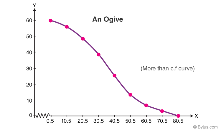
This lesson focuses on making cumulative graphs (ogives) for quantitative data (like test scores or heights) to show how data builds up. Graphs help us see how many values are below a certain point. Context—like who the data is from—matters because it explains the patterns. For example, an ogive of “5 heights” could reflect kids or adults without context.
Quantitative data uses numbers to measure amounts (e.g., time, weight). We’ll create ogives (lines showing counts or parts up to a value) and compare them with dotplots, stem-and-leaf plots, histograms, and boxplots. Variation appears as how data piles up or spreads, helping us understand trends.
--Assignment:
Part 1: Guided Practice Activity
Work on your own. Use the data below from 15 students (from a class survey). Make an ogive, then practice with other graph types.
Data:
- Commute Times (minutes): 10, 12, 15, 18, 20, 22, 25, 28, 30, 32, 35, 38, 40, 45, 50
Tasks:
- Making an Ogive:
- Create an ogive (list cumulative counts or proportions for intervals like 0–15, 16–25, 26–35, 36–50; sketch a line by hand, e.g., 0–15: 3, 16–25: 7, 26–35: 11, 36–50: 15; connect points to show buildup).
-
How to Sketch It:
- Plot points based on the intervals' upper bounds on the X-axis and their cumulative counts on the Y-axis: (15, 3), (25, 7), (35, 11), (50, 15).
- Connect these points with a smooth line to show the buildup. Start the line at (0, 0) if including the lower bound, then rise to each point.
- Label the X-axis with the interval bounds (e.g., 0, 15, 25, 35, 50) and the Y-axis with the cumulative counts (e.g., 0, 3, 7, 11, 15).
- Write 1–2 sentences about variation (e.g., “Most commutes build up between 15 and 35 minutes, showing a common range.”).
- Extra Practice: Use your own data (e.g., “Homework Time: 20, 30…” from 5 days). Make an ogive and explain variation.
- Describing Patterns:
- Write 1–2 sentences describing a pattern and justifying with context (e.g., “Commuting peaks at 15–35 minutes, maybe due to nearby schools.”).
- Extra Practice: Describe a pattern in your “Homework Time” ogive from the extra practice.
- Reflection:
- Write 2–3 sentences comparing how an ogive and a histogram show data, and why context helps. (Example: “Ogives show how data adds up, while histograms show counts per group. Context like location explains why commutes cluster.”)
Part 2: Independent Practice
Look at this data from a survey of 12 students:
- Study Hours (hours): 1, 2, 2, 3, 3, 4, 4, 5, 5, 6, 7, 8
Tasks:
- Make an ogive (use intervals like 0–2, 3–4, 5–6, 7–8; sketch by hand, e.g., 0–2: 3, 3–4: 6, 5–6: 9, 7–8: 12).
- Write 2–3 sentences describing patterns in the ogive, justifying with context (e.g., “Study hours build up to 6, suggesting most students work moderately, maybe due to school demands.”).
- Extra Activity: Collect your own data (e.g., “Sleep Hours: 6, 7…” from 6 nights). Make an ogive, compare it to a histogram (sketch both by hand), and write why it could answer a question like “Do students sleep more on weekends?”
Homework Assignment
- Gather data from 5 people on a quantitative variable (e.g., minutes spent exercising: 15, 25…). Make an ogive and a histogram (sketch by hand), describe variation, and explain how context helps interpret it to share next class.