
Lesson - 4: Representing Quantitative Data with Graphs – Part 1
Representing Quantitative Data with Graphs – Part 1
Unit 1, Topic 1.5: Representing Quantitative Data with Graphs – Part 1
What We’re Learning About
How to make graphs for quantitative data (like heights or test scores) to show patterns. These graphs help us see how numbers spread out or group together. Context - like who the data is from - matters because it explains why patterns happen. For example, a graph of “5 heights” could be kids or adults without context.
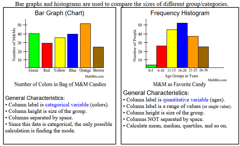
Quantitative data uses numbers to measure amounts (e.g., age, distance). We’ll use histograms (bars for counts in ranges), stem-and-leaf plots (numbers split into parts), and dotplots (dots for values). Variation shows up as differences in bar heights, leaf counts, or dot stacks, helping us understand the data.
--Assignment:
Part 1: Guided Practice Activity
Work on your own. Use the data below from 15 students (from a class survey). Make a histogram, stem-and-leaf plot, and dotplot, then describe patterns.
Data:
- Test Scores: 65, 68, 72, 75, 78, 80, 82, 85, 87, 88, 90, 92, 95, 98, 100
Tasks:
- Making Graphs:
- Create a histogram (A histogram is a bar graph that displays the frequency distribution of numerical data by grouping values into bins and showing the count of data points within each bin) (group scores into intervals like 60–70, 70–80, etc.; sketch bars by hand—e.g., 60–70: 2, 70–80: 3, 80–90: 6, 90–100: 4; note interval width affects look).
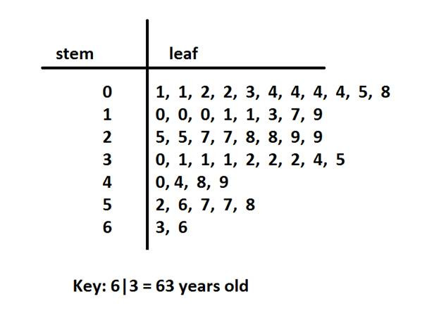
- Create a stem-and-leaf plot (split into stems and leaves, e.g., stem 6 | leaves 5, 8 for 65, 68).
- Create a dotplot (stack dots above a number line from 60 to 100)
- Write 1–2 sentences about variation (e.g., “Scores cluster between 80 and 90, showing most did well.”).
- Extra Practice: Use your own data (e.g., “Daily Steps: 5000, 6000…” from 5 days). Make a dotplot and explain variation.

- Describing Patterns:
- Write 1–2 sentences describing a pattern and justifying with context (e.g., “Most scores are above 80, maybe because it’s an advanced class.”).
- Extra Practice: Describe a pattern in your “Daily Steps” dotplot from the extra practice.
- Reflection:
- Write 2–3 sentences about how these graphs show variation and why other graph types (like boxplots) might help. (Example: “Histograms show a peak at 80–90, while dotplots show each score. Boxplots could add details like the middle value.”)
Part 2: Independent Practice
Look at this data from a survey of 10 students:
- Heights (cm): 150, 152, 155, 158, 160, 162, 165, 168, 170, 172
Tasks:
- Make a histogram (use intervals like 150–155, 156–160, etc.; sketch by hand), a stem-and-leaf plot, and a dotplot (draw by hand).
- Write 2–3 sentences describing patterns in the graphs, justifying with context (e.g., “Heights increase steadily, suggesting a group of growing teens.”).
- Extra Activity: Invent a dataset for 8 people (e.g., “Study Time (minutes): 30, 45…”). Make a histogram, stem-and-leaf plot, and dotplot, explain variation, and write why it could answer a question like “Do students study more on weekends?”
Homework Assignment
- Collect data from 5 people on a quantitative variable (e.g., time spent on homework in minutes: 20, 30…). Make a histogram, stem-and-leaf plot, and dotplot (sketch by hand), describe variation, and explain how context helps interpret it to share next class.