
Unit 1 - Lesson 2: Representing Categorical Data with Tables
What We’re Learning About
Today, we’re learning how to organize categorical data (like favorite colors or hand dominance) into tables. These tables help us see patterns and answer questions, such as “Which category is most common?” Numbers in tables need context - like who the data comes from - to make sense.
For example, a table showing “5 reds” could mean 5 red cars or 5 red shirts without context.
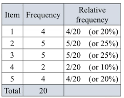
Categorical data groups things into labels (e.g., yes/no, colors). We use tables to show counts (how many in each group) or relative frequencies (what part of the total each group is). Variation shows up as differences in these numbers, which helps us understand the data better.
- Assignment:
Part 1: Warm-Up Activity
Here’s a small set of data about favorite ice cream flavors from 6 students:
• Vanilla, Chocolate, Vanilla, Strawberry, Chocolate, Vanilla
Wrong Statement: "Vanilla is the favorite for everyone."
• Point out what’s wrong with this statement.
• Write 1–2 sentences explaining why context
Part 2: Guided Practice Activity
Use the data below from 12 students (from a class survey). Make frequency and relative frequency tables, and explain patterns.
Data:
• Favorite Season: Winter, Spring, Summer, Fall, Winter, Spring, Summer, Winter, Fall, Spring, Summer, Winter
Tasks:
1. Making Tables:
o Create a frequency table (count how many times each season appears).

o Create a relative frequency table (turn counts into parts of the total, e.g., divide by 12).
o Write 1–2 sentences about variation (e.g., “Winter has the most with 4, showing it’s popular among these students.”).
o Extra Practice: Use your own data (e.g., “Favorite Animal: Dog, Cat…” from 5 friends). Make a frequency table and explain variation.
2. Checking and Explaining:
o Check the tables for accuracy (e.g., totals should match 12).
o Sketch a simple bar graph (show heights for each season based on frequencies - graph not provided, draw by hand).
o Write 1–2 sentences interpreting a pattern (e.g., “Spring and Summer are close, suggesting similar popularity.”).
o Extra Practice: Sketch a bar graph for your “Favorite Animal” data from the extra practice.
3. Group Discussion:
o Compare your tables, variation notes, and graphs.
o Talk about: “How do tables show variation, and why does context (like student preferences) matter?” Write 2–3 sentences about what you found. (Example: “Tables show Winter leads with 4 out of 12, while context tells us these are teens who might like cold weather.”)
Part 3: Independent Practice
Look at this data from a survey of 8 students:
• Music Preference: Pop, Rock, Pop, Jazz, Rock, Pop, Jazz, Rock
Tasks:
• Make a frequency table and a relative frequency table for Music Preference.
• Write 2–3 sentences describing the data, including how variation shows up in the tables, and why context matters (e.g., “Pop is most common with 3 out of 8, which a table clearly shows. Context like age group could explain why Pop is popular.”).
• Extra Activity: Invent a dataset for 6 people (e.g., “Drink Choice: Soda, Water…”). Make frequency and relative frequency tables, explain variation, and sketch a bar graph (graph not provided, draw by hand). Write why it could answer a question like “Is water more popular than soda?”
Homework Assignment
• Collect data from 5 people on a categorical variable (e.g., favorite movie genre: Action, Comedy…). Make a frequency table, a relative frequency table, and a simple bar graph (sketch by hand) to share next class. Explain how variation shows up.